Embed & Style Gravity Forms Using Gutenberg Block Styler
Block Styler For Gravity Forms adds a Gravity Form Styler gutenberg block.
With this block you can embed a gravity form and style it.
This guide is a detailed guide on how to embed and style a gravity form.
Pre-requisites
- A WordPress website
- Gravity Forms plugin
- Block Styler For Gravity Forms plugin
Tools
- Computer
Total Duration : 10 minutes
Start your FREE trial. No credit cards required.
Step 1 - Add Gravity Form Styler Block On WordPress Page
-
Open a WordPress page in edit mode.
-
Gutenberg editor loads the page content.
-
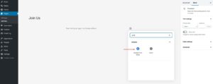
Search for the Gravity Form Styler block and select it.
-
The block is now added to the page.
Start your FREE trial. No credit cards required.
Step 2 - Embed Gravity Form On Gutenberg Block Editor
-
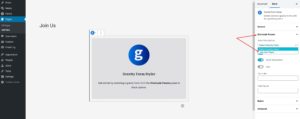
You need to select a gravity form for the block.
-
In the Gravity Form Styler block settings, select the Shortcode Params accordion setting.
-
Select a gravity form from the Select Gravityform dropdown
-
The gravity form will load on the gutenberg editor.
Start your FREE trial. No credit cards required.
Step 3 - Shortcode Parameter Settings
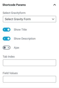
-
In the Gravity Form Styler block settings, select the Shortcode Params accordion setting.
-
Select Gravityform - Dropdown to select a gravity form
-
Show Title - A toggle switch to show/hide gravity form title
-
Show Description - A toggle switch to show/hide gravity form description
-
Ajax - A toggle switch. Enable to configure gravity forms submission via ajax. Disable to submit form using POST.
-
Tab Index - Specify the starting tab index for the fields of this form.
-
Field Values - Specify the default field values. Refer to https://docs.gravityforms.com/using-dynamic-population/ for details
Start your FREE trial. No credit cards required.
Step 4 - General Settings
-
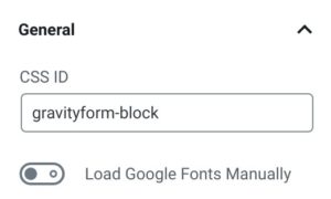
In the Gravity Form Styler block settings, select the General accordion setting.
-
CSS ID - Set the CSS ID selector for the gravity form
-
Load Google Fonts Manually - Styles for form title, description, label etc have ability to set a google font. Enable this toggle switch and google fonts will be loaded on the frontend automatically. Disable this toggle switch t and you will have to manually add the google fonts of the frontend.
Start your FREE trial. No credit cards required.
Step 5 - Form Wrapper Setting
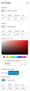
-
In the Gravity Form Styler block settings, select the Form Wrapper accordion setting.
-
A form wrapper is a main container that wraps the gravity form.
-
In this setting you can style
- Padding
- Margin
- Background Color/Image
- Border
- Border Radius
Start your FREE trial. No credit cards required.
Step 6 - Form Title Settings
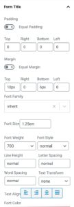
-
In the Gravity Form Styler block settings, select the Form Title accordion setting.
-
Form title, as the name suggests, is the title of the form. It is shown when the Show Title toggle in Shortcode Params settings is enabled.
-
Add styles for
- Padding
- Margin
- Font Family
- Font Size
- Font Weight
- Font Style
- Line Height
- Letter Spacing
- Word Spacing
- Text Transformation
- Text Alignment
- Font Color
Start your FREE trial. No credit cards required.
Step 7 - Form Description Settings
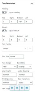
-
In the Gravity Form Styler block settings, select the Form Description accordion setting.
-
Form description, as the name suggests, is the description of the form. It is shown when the Show Description toggle in Shortcode Params settings is enabled.
-
Add styles for
- Padding
- Margin
- Font Family
- Font Size
- Font Weight
- Font Style
- Line Height
- Letter Spacing
- Word Spacing
- Text Transformation
- Text Alignment
- Font Color
Start your FREE trial. No credit cards required.
Step 8 - Progress Bar Wrapper Settings
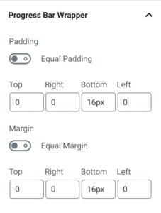
-
In the Gravity Form Styler block settings, select the Progress Bar Wrapper accordion setting.
-
Progress bar wrapper is the container that wraps a progress bar.
-
Add styles for
- Padding
- Margin
Start your FREE trial. No credit cards required.
Step 9 - Progress Bar Title Settings
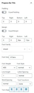
-
In the Gravity Form Styler block settings, select the Progress Bar Title accordion setting.
-
Its represents the
Step x of xtext of the progress bar -
Add styles for
- Padding
- Margin
- Font Family
- Font Size
- Font Weight
- Font Style
- Line Height
- Letter Spacing
- Word Spacing
- Text Transformation
- Text Alignment
- Font Color
Start your FREE trial. No credit cards required.
Step 10 - Progress Bar Settings
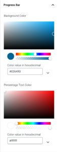
-
In the Gravity Form Styler block settings, select the Progress Bar accordion setting.
-
This is for styling the progress bar element.
-
Add styles for
- Background Color
- Percentage Text Color
Start your FREE trial. No credit cards required.
Step 11 - Section Break Container Settings
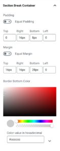
-
In the Gravity Form Styler block settings, select the Section Break Container accordion setting.
-
Section break, break up fields into different sections. The section break container is the container the wraps section break title and description
-
Add styles for
- Padding
- Margin
- Border Bottom Color
Start your FREE trial. No credit cards required.
Step 12 - Section Break Title Settings
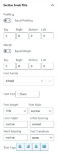
-
In the Gravity Form Styler block settings, select the Section Break Title accordion setting.
-
Style the title of the section break.
-
Add styles for
- Padding
- Margin
- Font Family
- Font Size
- Font Weight
- Font Style
- Line Height
- Letter Spacing
- Word Spacing
- Text Transformation
- Text Alignment
- Font Color
Start your FREE trial. No credit cards required.
Step 13 - Section Break Description Settings
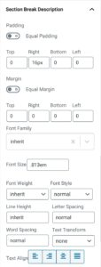
-
In the Gravity Form Styler block settings, select the Section Break Description accordion setting.
-
Style the description of a section break.
-
Add styles for
- Padding
- Margin
- Font Family
- Font Size
- Font Weight
- Font Style
- Line Height
- Letter Spacing
- Word Spacing
- Text Transformation
- Text Alignment
- Font Color
Start your FREE trial. No credit cards required.
Step 14 - Standard Field Label Settings
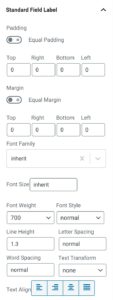
-
In the Gravity Form Styler block settings, select the Standard Field Label accordion setting.
-
It represents the label for input element
-
Add styles for
- Padding
- Margin
- Font Family
- Font Size
- Font Weight
- Font Style
- Line Height
- Letter Spacing
- Word Spacing
- Text Transformation
- Text Alignment
- Font Color
Start your FREE trial. No credit cards required.
Step 15 - Required Field Indicator (Asterix) Settings
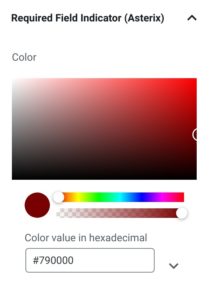
-
In the Gravity Form Styler block settings, select the Required Field Indicator (Asterix) accordion setting.
-
This represents the asterix character shown for required fields.
-
Set color for the character
Start your FREE trial. No credit cards required.
Step 16 - Sub-Label Settings
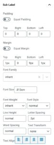
-
In the Gravity Form Styler block settings, select the Sub-Label accordion setting.
-
It represents the sub-label text for input elements.
-
Add styles for
- Padding
- Margin
- Font Family
- Font Size
- Font Weight
- Font Style
- Line Height
- Letter Spacing
- Word Spacing
- Text Transformation
- Text Alignment
- Font Color
Start your FREE trial. No credit cards required.
Step 17 - Input Field Container Settings
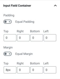
-
In the Gravity Form Styler block settings, select the Input Field Container accordion setting.
-
Its the main container for an input field. It encloses the label, sublabel, description, error, input field etc elements.
-
Add styles for
- Padding
- Margin
Start your FREE trial. No credit cards required.
Step 18 - Input Field Description Settings
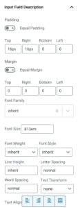
-
In the Gravity Form Styler block settings, select the Input Field Description accordion setting.
-
It represents the text that describes an input field
-
Add styles for
- Padding
- Margin
- Font Family
- Font Size
- Font Weight
- Font Style
- Line Height
- Letter Spacing
- Word Spacing
- Text Transformation
- Text Alignment
- Font Color
Start your FREE trial. No credit cards required.
Step 19 - Input Field Settings
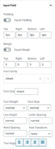
-
In the Gravity Form Styler block settings, select the Input Field accordion setting.
-
It represents input fields for text, textarea and select dropdown.
-
Add styles for
- Padding
- Margin
- Font Family
- Font Size
- Font Weight
- Font Style
- Line Height
- Letter Spacing
- Word Spacing
- Text Transformation
- Text Alignment
- Font Color
- Border
- Border Radius
- Background
Start your FREE trial. No credit cards required.
Step 20 - Input Placehoder Settings
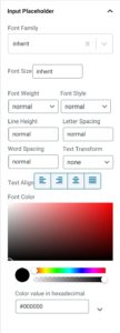
-
In the Gravity Form Styler block settings, select the Input Placehoder accordion setting.
-
It represents the placeholder text used for elements like text, textarea and select dropdown.
-
Add styles for
- Padding
- Margin
- Font Family
- Font Size
- Font Weight
- Font Style
- Line Height
- Letter Spacing
- Word Spacing
- Text Transformation
- Text Alignment
- Font Color
Start your FREE trial. No credit cards required.
Step 21 - Footer Settings
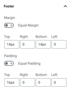
-
In the Gravity Form Styler block settings, select the Footer accordion setting.
-
It represents the section that wraps submit, next and previous button
-
Add styles for
- Margin
- Padding
Start your FREE trial. No credit cards required.
Step 22 - Button Settings
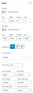
-
In the Gravity Form Styler block settings, select the Button accordion setting.
-
It represents the buttons in a gravity form
-
Add styles for
- Margin
- Padding
- Button Alignment
- Font Family
- Font Size
- Font Weight
- Font Style
- Line Height
- Letter Spacing
- Word Spacing
- Text Transformation
- Text Alignment
- Font Color, both default and hover
- Background Color, both default and hover
- Border, both default and hover
- Border Radius, both default and hover
Start your FREE trial. No credit cards required.
Step 23 - Confirmation Message Settings
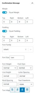
-
In the Gravity Form Styler block settings, select the Confirmation Message accordion setting.
-
It represents the confirmation message on successful form submission.
-
Add styles for
- Padding
- Margin
- Font Family
- Font Size
- Font Weight
- Font Style
- Line Height
- Letter Spacing
- Word Spacing
- Text Transformation
- Text Alignment
- Font Color
- Background
- Border
- Border Radius
Start your FREE trial. No credit cards required.
Step 24 - Validation Message (Form) Settings
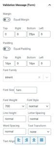
-
In the Gravity Form Styler block settings, select the Validation Message (Form) accordion setting.
-
It represents the validation error message shown at the top of the form.
-
Add styles for
- Padding
- Margin
- Font Family
- Font Size
- Font Weight
- Font Style
- Line Height
- Letter Spacing
- Word Spacing
- Text Transformation
- Text Alignment
- Font Color
- Background
- Border
Start your FREE trial. No credit cards required.
Step 25 - Field Validation Settings
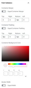
-
In the Gravity Form Styler block settings, select the Field Validation accordion setting.
-
It represents the validation error a form field.
-
Add styles for
- Container Margin - The container that wraps the error message
- Container Padding - The container that wraps the error message
- Container Background Color - The container that wraps the error message
- Border
- Font Family
- Font Size
- Font Weight
- Font Style
- Line Height
- Letter Spacing
- Word Spacing
- Text Transformation
- Text Alignment
- Font Color
Start your FREE trial. No credit cards required.
Step 26 - Advanced Settings
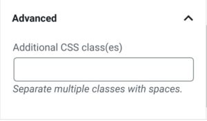
-
In the Gravity Form Styler block settings, select the Advanced accordion setting.
-
Set custom CSS classes for the gravity form
Start your FREE trial. No credit cards required.