The Ultimate Gutenberg Block Gravity Forms Styler
Override the default bland gravity form style & customize as per your website branding.
Gravity forms is one of the leading form builder. Website owners use it to collect visitor information. Contact forms, calculator forms, job application forms etc are common use cases.
The default gravity form style is pretty bland. A form’s style must comply to the website branding.
Start your FREE trial. No credit cards required.
Gutenberg Block With Styling Options
Gutenberg is fast-loading interactive WordPress Visual Editor. It’s fast, interactive, customizable & widely accepted. More and more people including agencies are using it for building websites.
Gutenberg Block Styler For Gravity Forms provides a gutenberg block to interactively style a gravity form.
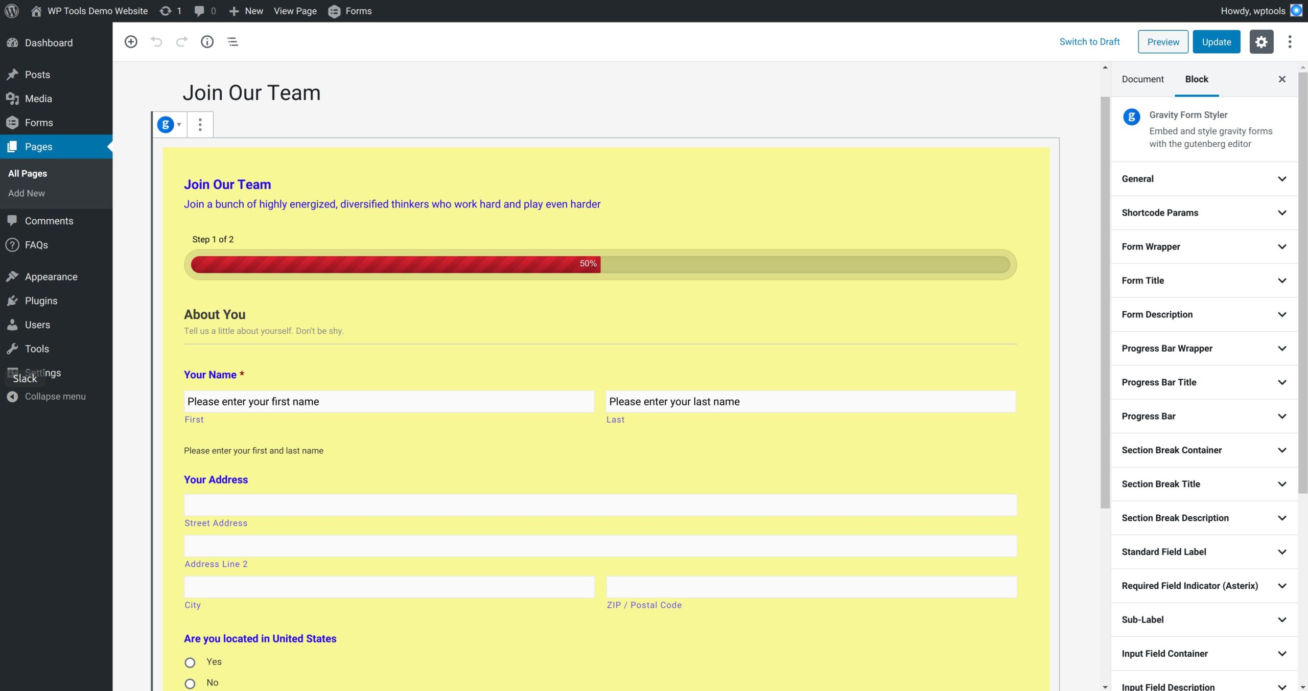
It provides ton of style options for all the different elements of a gravity form. All the style customization happen real-time within the gutenberg editor. This gives you live feedback that allows you to make any adjustments instantly.
Here’s a brief overview on styling & embedding options.
- General – Set CSS ID, toggle for google font loader.
- Shortcode Params – Select and embed a gravity form.
- Form Wrapper – It’s the main wrapper that contains the form. Set styles for margin, padding, background, border & border radius
- Form Title – Set margin, padding and typography for the form’s title.
- Form Description – Set margin, padding and typography for the form’s description.
- Progress Bar Wrapper – A multi-page gravity form can have a progress bar to show page progress. The progress bar wrapper is a main container around the progress bar. Set margin and padding for it.
- Progress Bar Title – One of the elements of a progress bar is the title. Set styles for margin, padding, typography and opacity.
- Progress Bar – It’s the main progress bar element. Set background color for progress completed and the color for the percentage text.
- Section Break Container – A section break is a content separator for your gravity form. The section break container is the main wrapper for the section break. Set styles for margin, padding and border bottom color.
- Section Break Title – Style the margin, padding and typography for the title of the section break.
- Section Break Description – Style the margin, padding and typography for the description of the section break.
- Standard Field Label – It’s the label for the input elements on the form. Set styles for margin, padding and typography.
- Required Field Indicator (Asterix) – For a required field, an asterix prefixes next to the label. Set style for asterix color.
- Sub-Label – Complex gravity form input element like name has multiple input elements like first name, last name etc. Sub-label is the label for such elements. Set styles for margin, padding and typography.
- Input Field Container – It’s the main container wrapping the input field. Set styles for margin and padding.
- Input Field Description – Each input field can have a description. Set styles for margin, padding and typography.
- Input Field – It handles generic style for input fields like text, email, tel, url, textarea and select elements. Set styles for margin, padding, typography, border, border radius and background.
- Input placeholder – A text and textarea element can have placeholder text. Set style for typography for such elements.
- Footer – A footer for gravity form holds the submit buttons. Set styles for margin and padding for the footer.
- Button – A gravity form has submit, next and previous button. Set styles for button margin, padding, alignment, typography, background, border and border radius.
- Confirmation Message – On successful submission of a form, a confirmation message is show. Set styles for margin, padding, background, typography, border and border radius of such message.
- Validation Message (Form) – This validation message shows on the top of the gravity form. Set styles for margin, padding, typography, background and border.
- Field Validation – This styles the validation error shown next to a field. Style the field errors margin, padding, background, border and typography.
Start your FREE trial. No credit cards required.