How To Style Contact Form 7 In Divi Theme
Contact Form 7 is popular form builder plugin. It has over million active installs.
Contact form 7 provides bare-bones style for a form. It’s done by design, as you can customize it as per your website branding.
Pre-requisites
- A WordPress website
- Divi Theme by Elegant Themes
- Contact Form 7 plugin
- Grid & Styler For Contact Form 7 And Divi plugin
Tools
- Computer
Total Duration : 10 minutes
Start your FREE trial. No credit cards required.
Step 1 - Create a grid layout for the contact form 7
-
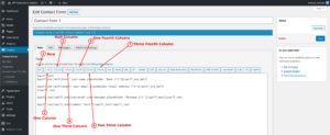
This plugin provides grid elements like row and columns (of different widths) like 1, 1/2, 1/3, 1/4, 2/3 and 3/4
-
Use the nesting of columns within a row to create a grid layout.
-
For details visit https://wptools.app/how-to/how-to-create-grid-layout-for-contact-form-7/
Start your FREE trial. No credit cards required.
Step 2 - Embed the contact form 7 on a divi page
-
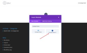
Open a page to edit on divi's visual builder
-
An a Contact Form 7 divi module on the page.
-
Select a contact form 7 item from the module settings
-
Watch the video below
Start your FREE trial. No credit cards required.
Step 3 - Style contact form 7 using the divi module
-
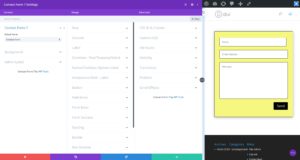
Divi module supports style for
- Form wrapper - This element is the main container for the form. It's represented by the
.wpcf7selector- To style padding and margin, goto Design Tab > Spacing
- To style background, goto Content Tab > Background
- To style border, goto Design Tab > Border
- To style box shadow, goto Design Tab > Box Shadow
- Row - This element is a row item for the grid layout
- To style padding and margin, goto Design Tab > Row
- Column - This element is a column item for the grid layout
- To style padding and margin, goto Design Tab > Column
- Label - This element represents a label used for an input element.
- To style padding,margin and font styles, goto Design Tab > Label
- Text, textarea and select The form fields are group into one category as they have common styling needs. Goto Design Tab > Common - Text, textarea and select and style
- Background
- Border & border radius
- Font styles
- Margin and padding
- Radio / Checkbox Options label This represent a label field for the radio/checkbox options list.
- To style margin, padding and font styles goto Design Tab > Radio / Checkbox Options label
- Acceptance field - Label - This field represent text description of a acceptance checkbox field. A user needs to check this field to indicate he/she has read the description and accept it.
- Style the description's margin, padding and font styles by going to Design Tab > Acceptance field
- Button - This field represents the submit button for a contact form. Goto Design Tab > Button and style
- Alignment
- Font Styles
- Margin and padding
- Box shadow
- Background
- Border and border radius
- Field Error This represent the error shown for a field when the field contains invalid data.
- To style margin, padding and font styles goto Design Tab > Field error
- Form Error - This error message is shown at the top of the form when an invalid form is submitted.
- To style margin, padding, background, border, border radius and font styles goto Design Tab > Form Error
- Form Success - This success message is shown at the top of the form when a valid form is submitted.
- To style margin, padding, background, border, border radius and font styles goto Design Tab > Form Success
- Form wrapper - This element is the main container for the form. It's represented by the
Start your FREE trial. No credit cards required.